With millions of tablet and smartphone users nowadays, it is vital to optimize your site to serve great appearance of your site to these smaller-screen users. There are various popular approaches to this, one of them is a responsive design.
We’re not going to cover all of the details of responsive design here. If you’re new to this concept of responsive web design, these are recommended articles to get started:
- Responsive Web Design Guidelines and Tutorials via SmashingMagazine
- Beginner’s Guide to Responsive Web Design via TeamTreeHouse
- 21 Fresh Examples of Responsive Web Design via WebDesignerLedger
Last year, Mashable published an article on few reasons why responsive web design will become a trend in 2013. Many new WordPress themes are also designed to be responsive. These are some of them:
If you’re WordPress theme developer and designer, designing a responsive WordPress theme is very challenging. With many devices with different screen sizes, it is difficult to know how is your theme looks like in different screen sizes. Fortunately, there are various tools to help you to test preview your responsive WordPress theme:
1. Responsive design testing tool by Matt Kersley
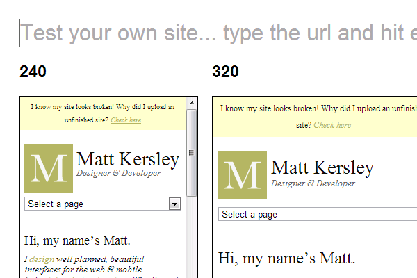
This is a free and open source project by Matt Kersley. The code is available from Githubso you can fork it or use it for your own personal server or localhost. We even using it in our localhost to preview any theme we design for clients.
2. Mozilla Firefox Responsive Design View Tool
This is another our favorite tool. You can enable it from Tools > Web Developer > Web Designer View.
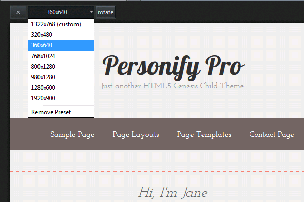
There are presets of various screen sizes from popular devices available from the dropdown. Interestingly, you can also click on the Rotate button to see how it looks like when users rotate their device.
3. Web-based Responsive Design Testing Tools
Besides two tools we mentioned above, there are also many web-based tools available to test your responsive WordPress theme such as
Although there are various responsive design testing tools available, we believe it is important to use more than one testing tool as each of them has pros and cons.
Leave a Reply